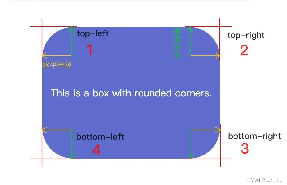
一、边框弧度
使用它你就可以制作盒子边框圆角
| border-radius: | |
| 1个值 | 四个圆角值相同 |
| 2个值 | 第一个值为左上角与右下角,第二个值为右上角与左下角 |
| 3个值 | 第一个值为左上角, 第二个值为右上角和左下角,第三个值为右下角 |
| 4个值 | 左上角,右上角,右下角,左下角。 |
| 属性 | 描述 |
|---|---|
| border-radius | 所有四个边角 border-*-*-radius 属性的缩写 |
| border-top-left-radius | 定义了左上角的弧度 |
| border-top-right-radius | 定义了右上角的弧度 |
| border-bottom-right-radius | 定义了右下角的弧度 |
| border-bottom-left-radius | 定义了左下角的弧度 |
<!DOCTYPE html>
<head><meta charset="UTF-8"><meta name="viewport" content="width=device-width, initial-scale=1.0"><title>Document</title><style>div {width: 300px;height: 50px;background-color: aqua;border-radius: 25px;border-top-right-radius: 70px;}</style>
</head>
<body><div></div>
</body>
</html>
border-radius: 0.5*h; ---》变成一个胶囊
border-radius: 50%; ---》变成一个圆
斜杠'/'前设置水平半径,斜杠'/'后设置垂直半径,参数之间以空格隔开。
| border-radius:参数 | 释义 |
| border-radius: 100px/50px; | 四角的水平半径为100px,垂直半径为50px |
| border-radius: 50px 20px/30px 60px; | ①左上与右下圆角 ②左下与右上圆角 |
| border-radius: 50px 20px 20px/30px 60px 40px; | ①左上 ②左下与右上圆角 ③右下 |
| border-radius: 10px 20px 20px 10px/10px 10px 20px 10px; | ①左上②右上③右下④左下 |
二、盒子阴影
box-shadow: x轴的偏移量 y轴的偏移量 模糊的半径 扩散的半径 阴影颜色 内/外阴影
/* x轴的偏移量 y轴的偏移量必须写 */
| 值 | 描述 |
| x-shadow | x轴的偏移量,必需,可以为负值 |
| y-shadow | x轴的偏移量,必需,可以为负值 |
| blur | 模糊的半径,不可以为负值 |
| spread | 扩散的半径,不可以为负值 |
| color | 阴影颜色 |
| insert | 内阴影(inset)/外阴影(outset)默认 |
<!DOCTYPE html>
<head><meta charset="UTF-8"><meta name="viewport" content="width=device-width, initial-scale=1.0"><title>Document</title><style>div {width: 100px;height: 100px;background-color: pink;box-shadow: 5px 2px 10px 10px black inset;}</style>
</head>
<body><div></div></body>
</html>
三、文字阴影
text-shadow:水平位置 垂直位置 模糊距离 阴影颜色;
| 值 | 描述 |
| x-shadow | x轴的偏移量,必需,可以为负值 |
| y-shadow | x轴的偏移量,必需,可以为负值 |
| blur | 模糊的半径,不可以为负值 |
| color | 阴影颜色 |
<!DOCTYPE html>
<head><meta charset="UTF-8"><meta name="viewport" content="width=device-width, initial-scale=1.0"><title>Document</title><style>p {text-shadow: 5px 5px 3px pink;}</style>
</head><body><p>ncjdncjdc</p>
</body>
</html>
四、列表属性
list-style属性是一个简写对属性集合,
- 包括 list-style-type 和 list-style-image与list-style-position。
list-style-image:指定一个能用来作为列表元素标记的图片。
- list-style-image: url("图片路径");
<!DOCTYPE html>
<head><meta charset="UTF-8"><title>Document</title><style>ul{margin: 0 200px;display: block;list-style-image: url("../img/鲁迅.jfif");list-style-position: inherit;
}</style>
</head><body><ul>List 3<li>List Item 3-1</li><li>List Item 3-2</li><li>List Item 3-3</li></ul>
</body>
</html>
list-style-position:指定标记框在主体块框中的位置
- list-style-position:inside 标记框位于主体块框外部。
- list-style-position:outside 标记框是主体块框中的第一个内联框,之后是元素的内容。
<!DOCTYPE html>
<head><meta charset="UTF-8"><title>Document</title><style>.one {list-style: square inside;
}.two {list-style-position: outside;list-style-type: circle;
}</style>
</head>
<body><ul class="one">List 1<li>List Item 1-1</li><li>List Item 1-2</li><li>List Item 1-3</li><li>List Item 1-4</li></ul><ul class="two">List 2<li>List Item 2-1</li><li>List Item 2-2</li><li>List Item 2-3</li><li>List Item 2-4</li></ul>
</body>
</html> 
list-style-type:列表样式类型
| list-style-type:列表样式类型 | 描述 |
| list-style-type: none; | 不显示列表项的标记。 |
| list-style-type: disc; | 实心圆点 (默认值) |
| list-style-type: circle; | 空心圆点 |
| list-style-type: square; | 实心方块 |
| list-style-type: decimal; | 十进制阿拉伯数字 |
| list-style-type: cjk-decimal; | 汉十进制数,例如一,二,三,...,九八,九九 |
| list-style-type:upper/lower-roman; | 大小写罗马数字编号 |
| list-style-type:upper/lower-greek; | 大小写希腊数字编号 |
| list-style-type: "-"; | 字符编号 |
| list-style-type: simp-chinese-informal; | 简体中文非正式编号。 一万一千一百一十一 |
| list-style-type: simp-chinese-formal ; | 简体中文正式编号,例如壹万壹仟壹佰壹拾壹 |
| list-style-type: trad-chinese-informal; | 繁体中文非正式编号, 例如一萬一千一百一十一 |
<!DOCTYPE html>
<html lang="en"><meta charset="UTF-8"><meta name="viewport" content="width=device-width, initial-scale=1.0"><title>Document</title><style>li {width: 200px;height: 200px;background-color: aqua;list-style: none;list-style-type: none;}</style>
</head><body><ul><li></li></ul>
</body>
</html>
五、resize
resize 用于设置元素是否可调整尺寸,以及可调整的方向,常见的textarea尺寸就是会变的
resize不适用于下列元素:
- 内联元素
- overflow 属性设置为
visible的块元素
| 参数 | 描述 |
| none | 元素不提供用户可控的调整其尺寸的方法。 |
| both | 元素显示可让用户调整其尺寸的机制,可沿水平和竖直方向调整尺寸。 |
| vertical | 元素显示可让用户沿竖直方向调整其尺寸的机制。 |
| horizontal | 元素显示可让用户沿水平方向调整其尺寸的机制。 |
<textarea style="resize: none;"></textarea>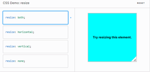
六、浮动
- 浮动最早是用来控制图片,以便达到其他元素(特别是文字)实现“环绕”图片的效果。
- 之后发现浮动有个特性:就是让任何盒子可以一行排列,因此用浮动的特性来布局了
① “环绕”图片的效果
<!DOCTYPE html>
<head><meta charset="UTF-8"><title>Document</title><style>.dad{width: 400px;height: 400px;background-color: aqua;}img{display: block;width: 100px;height:100px;float: right;}</style>
</head>
<body><div class="dad"><img src="../img/鲁迅.jfif" alt="">《朝花夕拾》原名《旧事重提》,是现代文学家鲁迅的散文集,收录鲁迅于1926年创作的10篇回忆性散文, [1]1928年由北京未名社出版,现编入《鲁迅全集》第2卷。此文集作为“回忆的记事”,多侧面地反映了作者鲁迅青少年时期的生活,形象地反映了他的性格和志趣的形成经过。前七篇反映他童年时代在绍兴的家庭和私塾中的生活情景,后三篇叙述他从家乡到南京,又到日本留学,然后回国教书的经历;揭露了半殖民地半封建社会种种丑恶的不合理现象,同时反映了有抱负的青年知识分子在旧中国茫茫黑夜中,不畏艰险,寻找光明的困难历程,以及抒发了作者对往日亲友、师长的怀念之情 [2]。文集以记事为主,饱含着浓烈的抒情气息,往往又夹以议论,做到了抒情、叙事和议论融为一体,优美和谐,朴实感人。作品富有诗情画意,又不时穿插着幽默和讽喻;形象生动,格调明朗,有强烈的感染力</div>
</body>
</html>
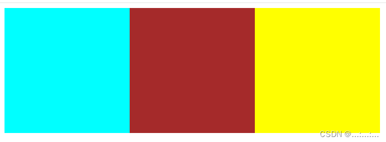
②盒子可以一行排列
<!DOCTYPE html>
<head><meta charset="UTF-8"><title>Document</title><style>.box1 {width: 200px;height: 200px;background-color: aqua;}.box2{width: 200px;height: 200px;background-color: brown;}.box3{width: 200px;height: 200px;background-color: yellow;}</style>
</head>
<body><div class="box1"></div><div class="box2"></div><div class="box3"></div>
</body>
</html>| 全部盒子加了float: left; 之前 | 全部盒子加了float: left; 之后 |
 |  |
浮动设置了浮动属性的元素会脱离标准普通流的控制,移动到其父元素中指定位置的过程。
选择器{float:属性值;}
| 属性值 | 描述 |
|---|---|
| left | 元素向左浮动 |
| right | 元素向右浮动 |
| none | 元素不浮动(默认值) |
- 浮动脱离标准流,不占位置,会影响标准流。浮动只有左右浮动。
- 浮动的元素总是找理它最近的父级元素对齐。但是不会超出内边距的范围。
- 浮动的元素会具有行内块元素的特性
- 首先浮动的盒子需要和标准流的父级搭配使用
- 若浮动盒子下有一个标准流盒子,盒中有文字,会尽量显示出来
- 若标准流父盒子有文字,会包围浮动盒子
- 浮动的元素排列位置:
跟上一个元素(块级)有关系。
- 如果上一个元素有浮动,则A元素顶部会和上一个元素的顶部对齐;
- 如果上一个元素是标准流,则A元素的顶部会和上一个元素的底部对齐。
③哥哥浮动盒子飘在弟弟标准流盒子的上面不占位置
<!DOCTYPE html>
<head><meta charset="UTF-8"><title>Document</title><style>.box2{width: 90px;height: 90px;background-color: brown;float: left;}.box3{width: 150px;height: 120px;background-color: yellow;}</style>
</head>
<body><div class="box2">2222</div><div class="box3">3333</div>
</body>
</html>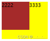
④弟弟浮动盒子在哥哥标准流盒子下面飘不上去,哥哥占了位置
.box2{width: 90px;height: 90px;background-color: brown;}.box3{width: 150px;height: 120px;background-color: yellow;float: left; }
<!DOCTYPE html>
<head><meta charset="UTF-8"><meta name="viewport" content="width=device-width, initial-scale=1.0"><title>Document</title><style>.box1 {width: 200px;height: 200px;background-color: aqua;float: left;}.out {width: 800px;height: 400px;background-color: brown;}.box2 {width: 300px;height: 300px;background-color: pink;float: right;}</style>
</head><body><div class="out"><div class="box1">1111111</div><div class="box2">2222</div></div>
</body></html>
七、浮动的问题
问题1、

解决方法 1
- 给父盒子设置高度
- 让父盒子浮动
- 保证父盒子是块元素的前提下,在父盒子后面加上伪元素选择器,其次写上clear:both clear:both----》 消除浮动的影响
<!DOCTYPE html>
<head><meta charset="UTF-8"><title>Document</title><style>.father {width: 700px;background-color: aqua;}.left {width: 300px;height: 300px;background-color: blue;float: left;}.father::after {content: "";display: block;clear: both;}</style>
</head><body><div class="father"><div class="left"></div></div>
</body></html>| 解决问题前 | 解决问题后 |
 |  |
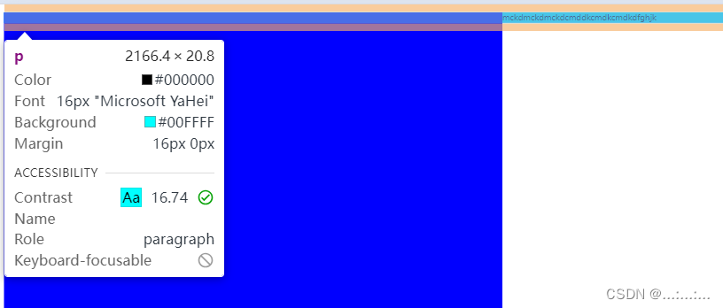
问题2、
浮动盒子遮挡住标准流盒子
<!DOCTYPE html>
<head><meta charset="UTF-8"><title>Document</title><style>.f{width: 500px;height:500px;background-color: blue;float: left;}p {background-color: aqua;clear: both; }/* p::before {display: block;content: "";clear: both;} */</style>
</head>
<body><div class="f"></div><p>mckdmckdmckdcmddkcmdkcmdkdfghjk</p>
</body>
</html>
解决方法2
1、 p {
clear: both;
}
2、p::before {
display: block;
clear: both;
}
| 解决问题前 |
 |
| 解决问题后 |
 |
八、flex布局
弹性盒子的特点就是
- 默认父盒子成为弹性容器的时候,中的子盒子会会变成弹性盒子,在一行排列
- 若子盒子没有给高度,会自动延伸成父元素高度
主轴:默认在水平方向
测轴:默认在垂直方向
子元素可以自动挤压和延伸
<!DOCTYPE html>
<head><meta charset="UTF-8"><title>Document</title><style>* {padding: 0;margin: 0;}ul {display: flex;width: 600px;height: 300px;background-color: aqua;margin: 0 auto;}li {list-style: none;width: 100px;height: 200px;background-color: aquamarine;}</style>
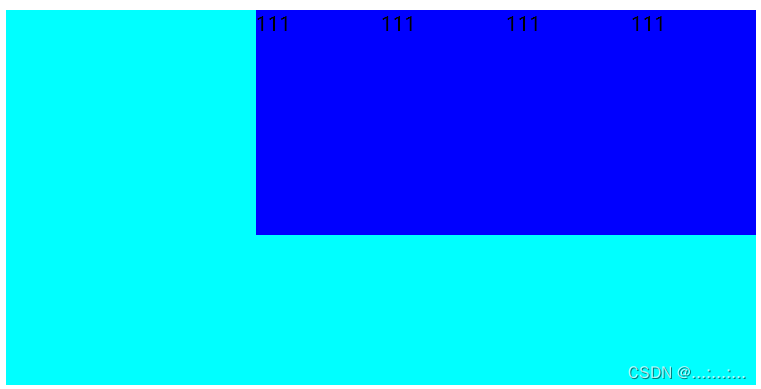
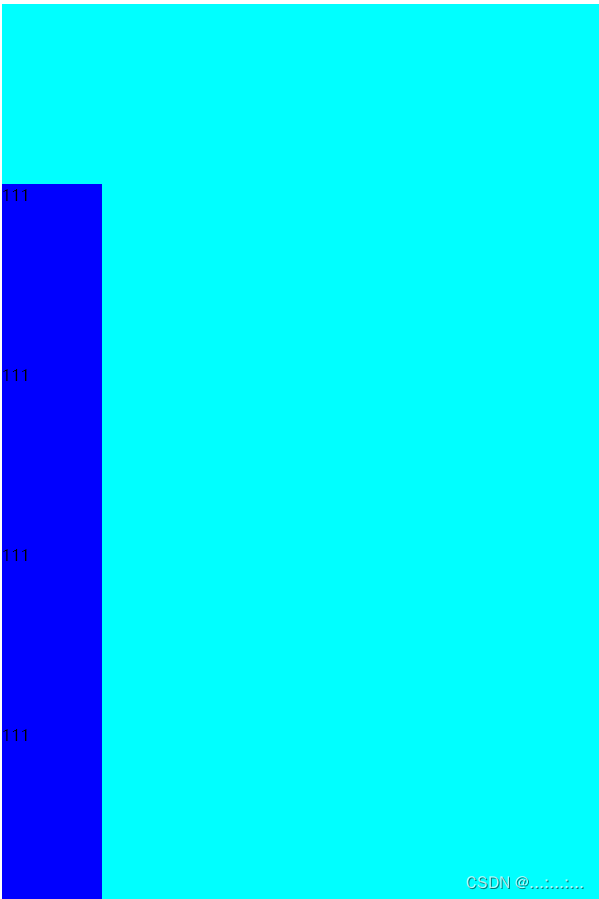
</head><body><ul><li>111</li><li>111</li><li>111</li><li>111</li><li>111</li><li>111</li><li>111</li><li>111</li></ul></body>
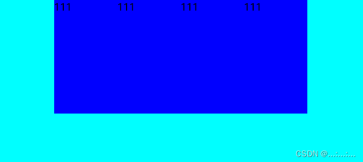
</html>| ******子元素设高度****** |
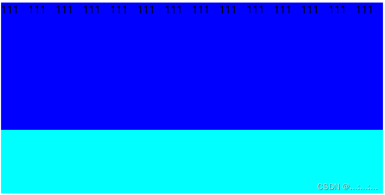
| 有高度时前提下,li 盒子在有设宽度的情况下,自动挤压和延伸 |
|
|
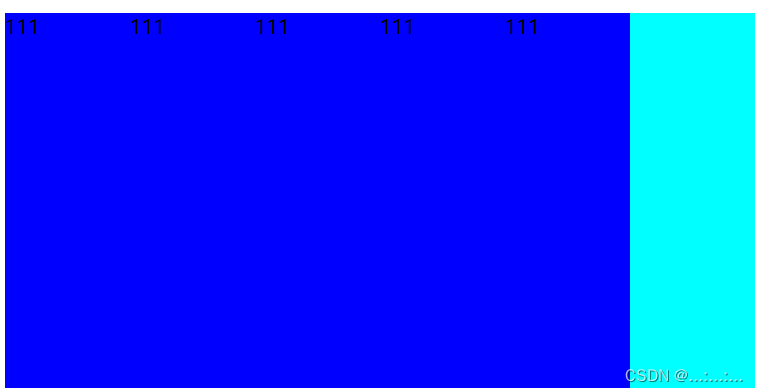
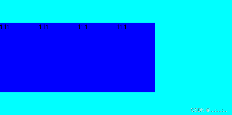
| 有高度时前提下,li 盒子在有设宽度的情况下,增加了一堆 li 盒子,发现,对子元素设宽度作用不大 |
|
|
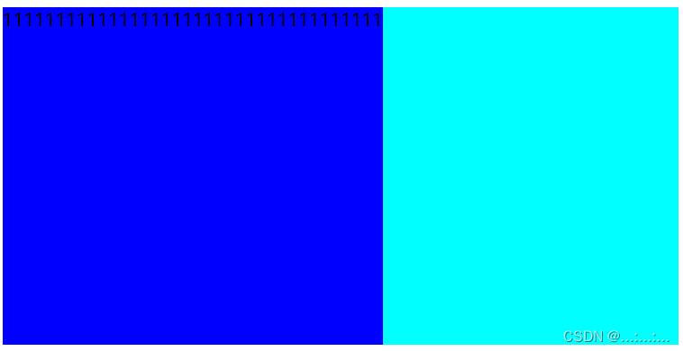
| ******子元素不设高度,会自动延申到父盒子宽度****** |
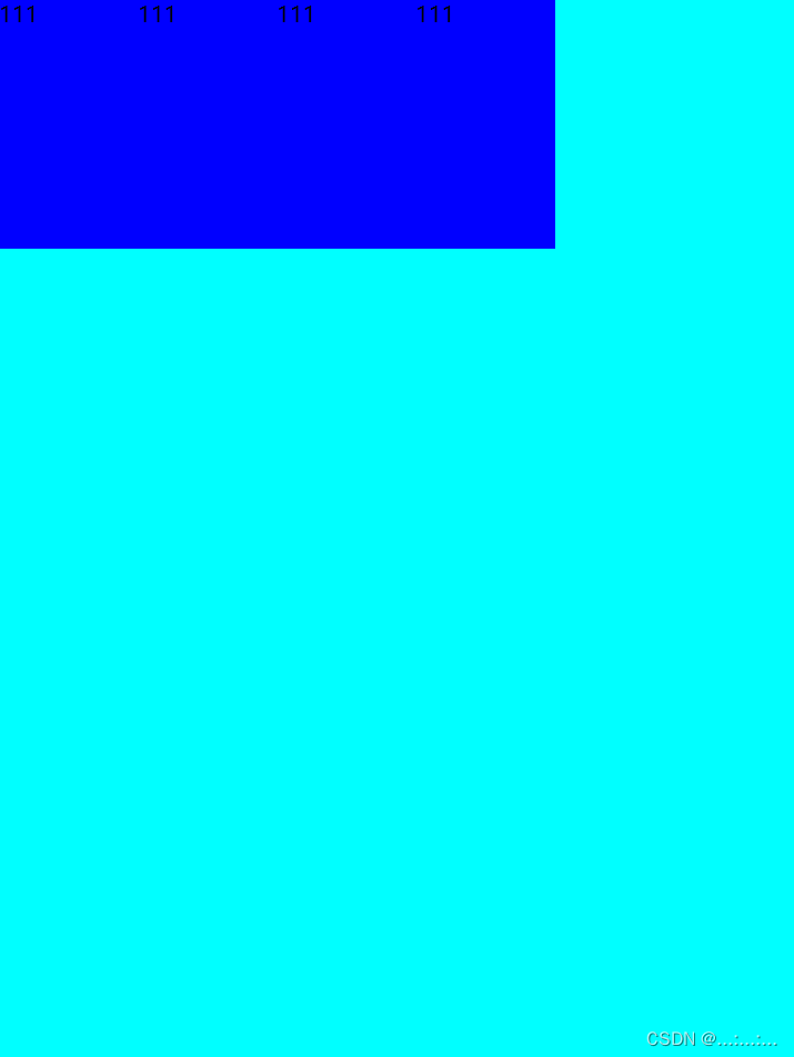
| 没有高度时前提下,li 盒子在有设宽度的情况下,没有自动挤满父盒子宽度 |
|
|
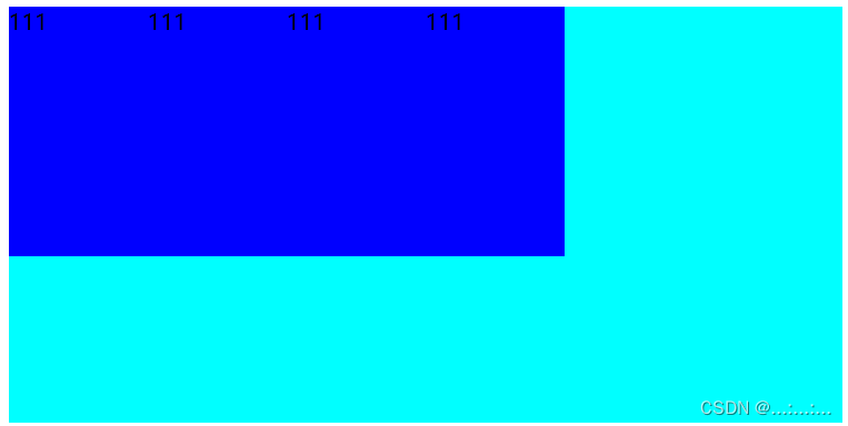
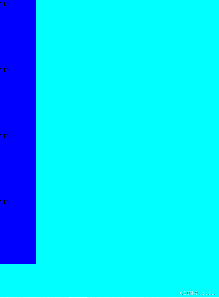
| 没有高度时前提下,li 盒子在没有设宽度的情况下,增加了一堆 li 盒子,没有自动挤满父盒子宽度 |
|
|

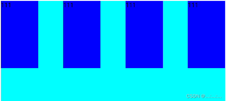
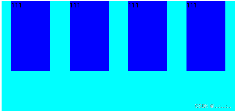
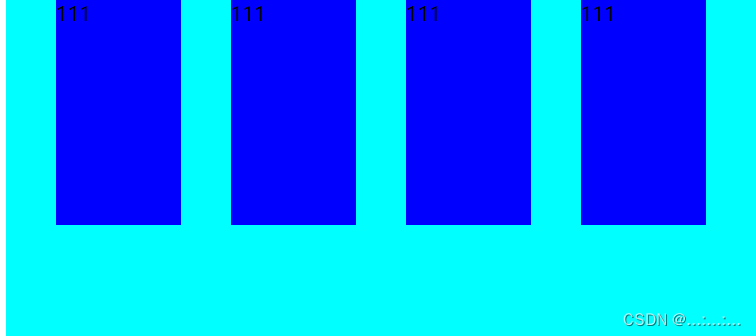
八.1、主轴上的对齐方式
主轴:默认在水平方向
<!DOCTYPE html>
<head><meta charset="UTF-8"><title>Document</title><style>* {padding: 0;margin: 0;}ul {display: flex;width: 600px;height: 300px;background-color: aqua;margin: 0 auto;}li {width: 100px;height: 180px;list-style: none;background-color: blue;}</style>
</head><body><ul><li>111</li><li>111</li><li>111</li><li>111</li></ul></body>
</html></ul>
</body>
</html>对齐方式在父盒子里面写
| 主轴对齐方式默认从左开始 : justify-content: flex-start; | 从后面开始:justify-content: flex-end; |
 |  |
| 两边贴边中间平分 justify-content: space-between; | 弹性盒子与弹性盒子之间的距离相等, justify-content: space-around |
 |  |
| 弹性盒子与弹性盒子之间的距离相等, 弹性盒子与弹性容器之间的距离相等 justify-content: space-evenly | 居中 justify-content: center |
 |  |
八.2、侧轴上的对齐方式
测轴:默认在垂直方向
还是上面的初始盒子
| 初始默认在上面:align-items: start; | 从末尾排起:align-items: end; |
 |  |
| 在中间:align-items: center; | 挑选其中一个子盒子单独设置 ul li:nth-child(3) { align-self: center; } |
 |  |
八.3、修改主轴方向
还是上面的初始盒子 ,只不过高度改长
| 主轴方向默认水平从左到右 | 主轴方向改为水平方向,从右到左 flex-direction: row-reverse |
|
|
|
| 主轴方向改为垂直方向,从上到下 flex-direction: column; | 主轴方向改为垂直方向,从下到上 flex-direction: column-reverse |
|
|
|

八.4、弹性伸缩比
在我们不确定宽度时,可以利用比例来让弹性盒子宽度自由变换
/* 整数:占用父级剩余尺寸的分数 */
子盒子写 flex:数字
<<!DOCTYPE html>
<head><meta charset="UTF-8"><title>Document</title><style>* {margin: 0;padding: 0;}ul {margin: 0 auto;display: flex;width: 700px;height: 400px;background-color: rgb(51, 59, 59);}li {list-style: none;height: 40px;background-color: aqua;}ul li:first-child {flex: 1;}ul li:nth-child(2) {flex: 2;background-color: royalblue;}ul li:last-child {flex: 1;}</style>
</head>
<body><ul><li>111</li><li>222</li><li>333</li></ul>
</body>
</html>
八.5、换行、
不够挤就换行 父盒子写:flex-wrap: wrap;
简直是布局好帮手佳人们!!
<!DOCTYPE html>
<head><meta charset="UTF-8"><title>Document</title><style>* {margin: 0;padding: 0;}ul {display: flex;width: 500px;height: 400px;background-color: aqua;flex-wrap: wrap;justify-content: space-between;align-content: space-evenly;}li {list-style: none;width: 150px;height: 150px;background-color: pink;}</style>
</head><body><ul><li>111</li><li>111</li><li>111</li><li>111</li><li>111</li><li>111</li></ul>
</body></html></html>
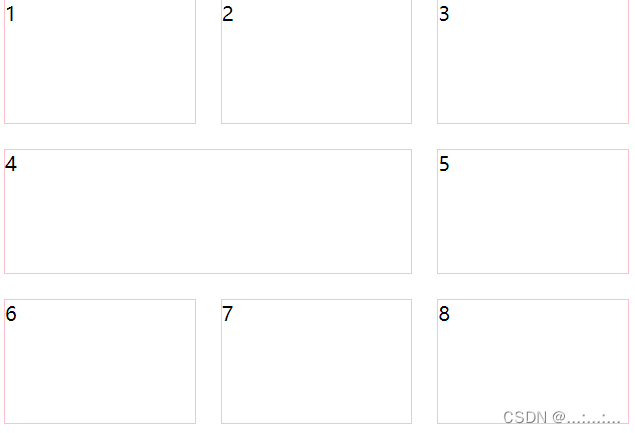
九、grid布局(浅谈)
<!DOCTYPE html>
<head><meta charset="UTF-8"><title>Document</title><style>.box {display: grid;width: 500px;height: 900px;grid-template-columns: 1fr 2fr 1fr;grid-template-rows: repeat(4, 100px);/* 单元格之间的间距 */grid-gap: 20px;}.box div {border: 1px solid pink;}</style>
</head><body><div class="box"><div>1</div><div>2</div><div>3</div><div>4</div><div>5</div><div>6</div><div>6</div><div>8</div><div>9</div></div>
</body>
</html>
grid-template-columns: 1fr 2fr 1fr:(水平方向)一行里按照1:2:1 的比例划分格子
grid-template-rows: repeat(4, 100px):(垂直方向)一列的高都是100px,重复4行
grid-gap: 20px; /* 单元格之间的间距 */

 .box {display: grid;width: 500px;height: 900px;grid-template-columns: 1fr 1fr 1fr ;grid-template-rows: repeat(4, 100px);grid-gap: 20px;}.test {/* grid-column-start: 1;grid-column-end: 3; */grid-column: 1/3;}
<div class="test">4</div>
水平跨行
更改了盒子水平比例为 1:1:1
grid-column-start: 1;+ grid-column-end: 3; ===== grid-column: 1/3;
可以理解为3-1=2,所以只横跨了两格,从第一个格子开始,不包括第三个格子
垂直跨列也相同道理